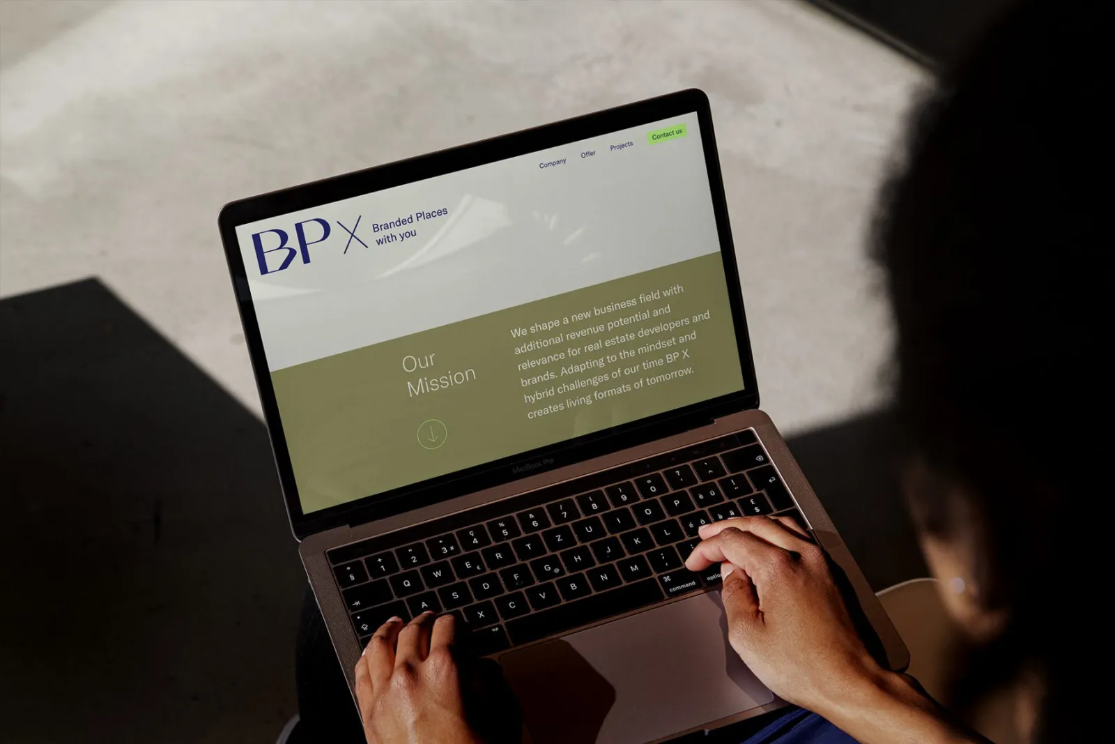
BP X advises property developers and brands on real estate that carries a brand of its own.
We developed the brand and the website for BP X: a typographic identity with an earthy colour palette and a sharp neon accent, supported by a lean illustration system. The stationery and presentation were designed by Tine Daum (opens in a new tab).
Brand and website were created together: the website picks up the brand’s typeface, colours and illustrations directly. How we approach brands is explained on the agency page under Branding & Design.
Our process: branding, design, implementation.
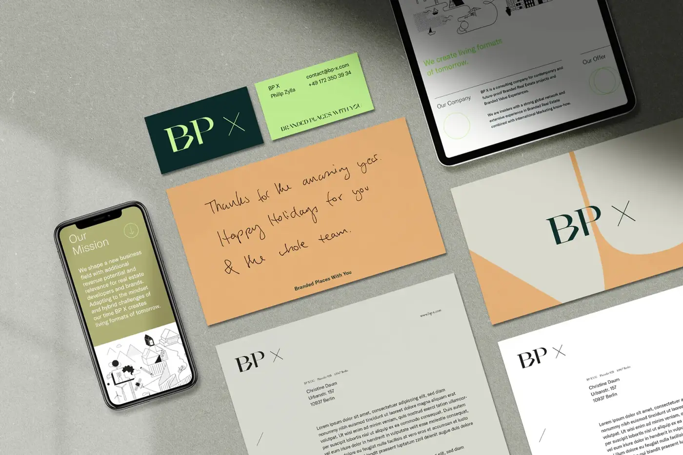
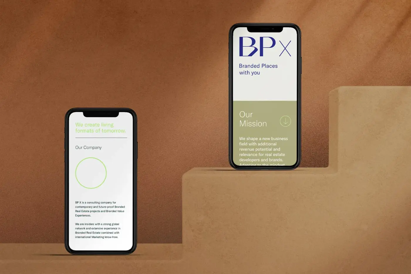
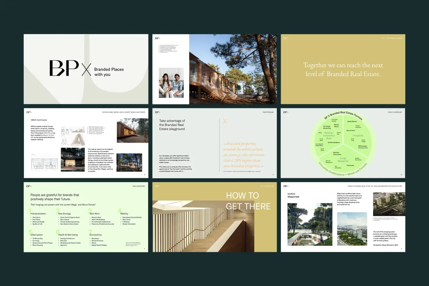
Design set
An excerpt from the visual identity as it appeared on the BP X website.
Colours
- Olive
#918E5B - Neon green
#B9F77B - Stone grey
#E1E2D9 - Anthracite
#363535
Typefaces
- Headings and body text
- GT America
Colours and typeface from bp-x.com, as of November 2022 (Internet Archive)